Adding texture and contrast with Prima Stencils
Posted by Leonie on
All the new Prima stencils can be found in the Sassy Online store HERE.
Last week I used distress inks to create THIS pretty background, this week it's all about creating texture and contrast on my scrapbook page.
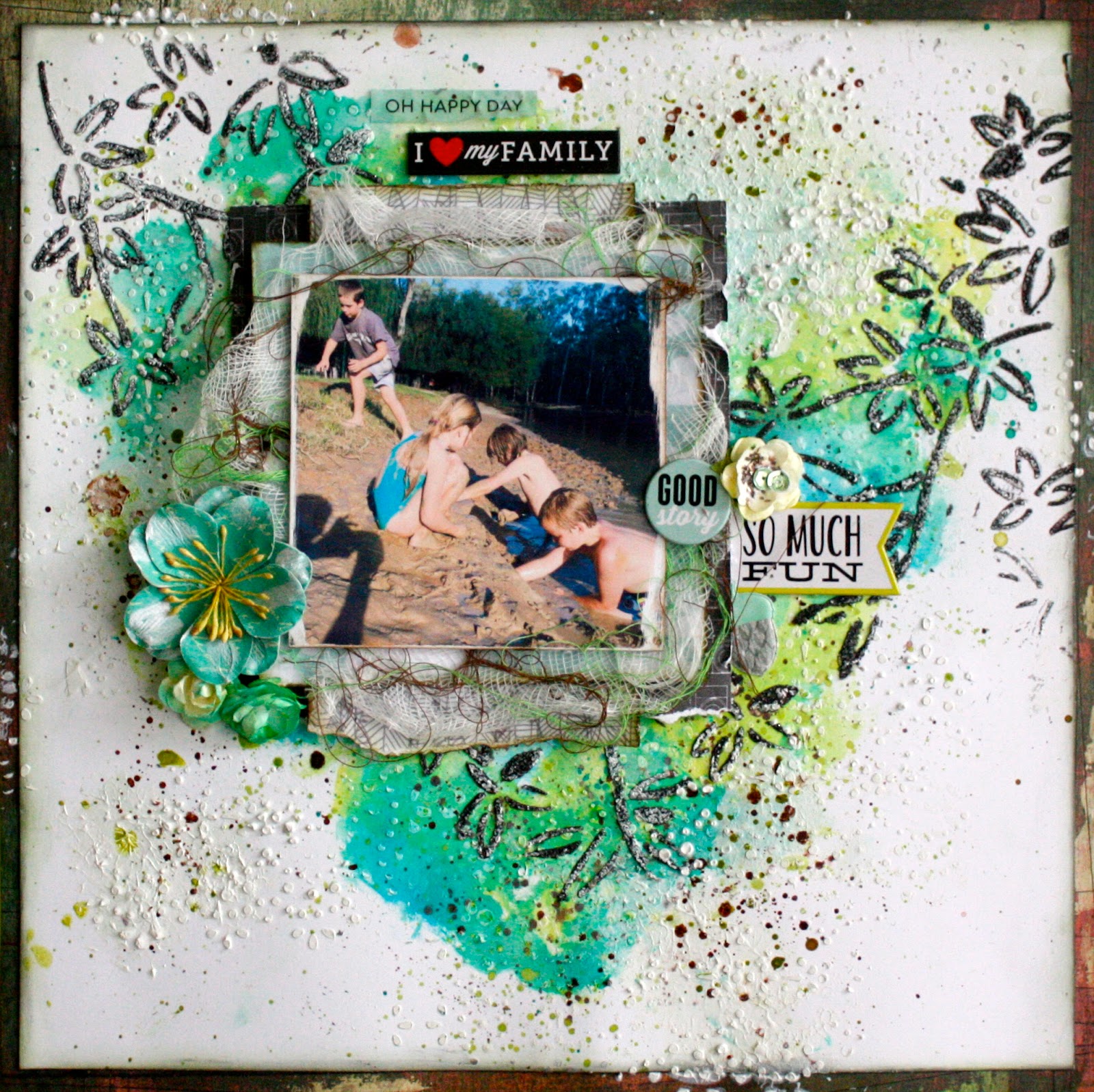
Here's the full page.
My four kiddo's getting very muddy while camping last Easter.
First up I used the Lace stencil below to add my first layer with modelling paste.
I really like using stencils like this that have a small patterns they're great for adding a
textural dimension to your background.


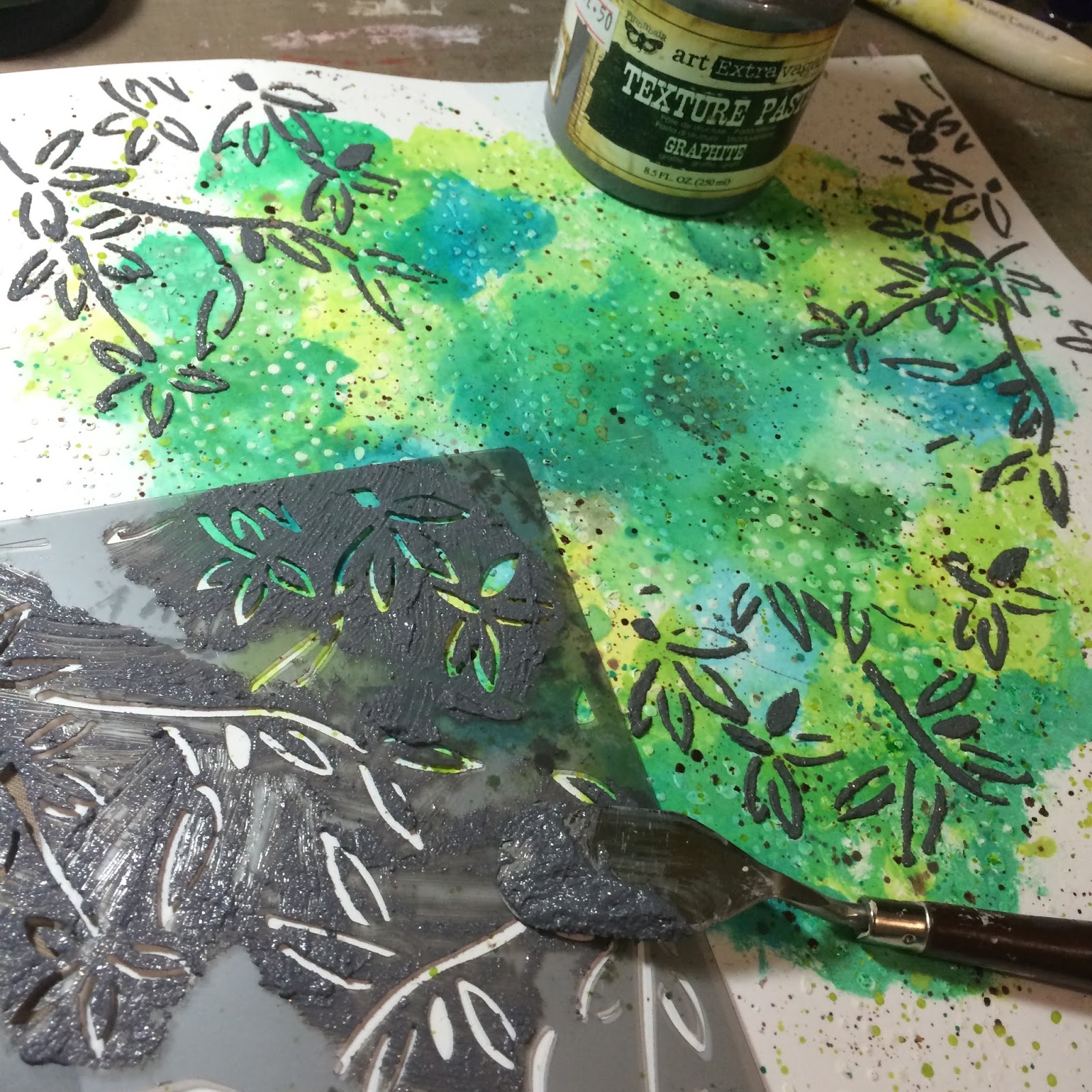
Next I added the colour with some watercolour paints and lots of splats and drips.
Also great for adding more texture to your page.
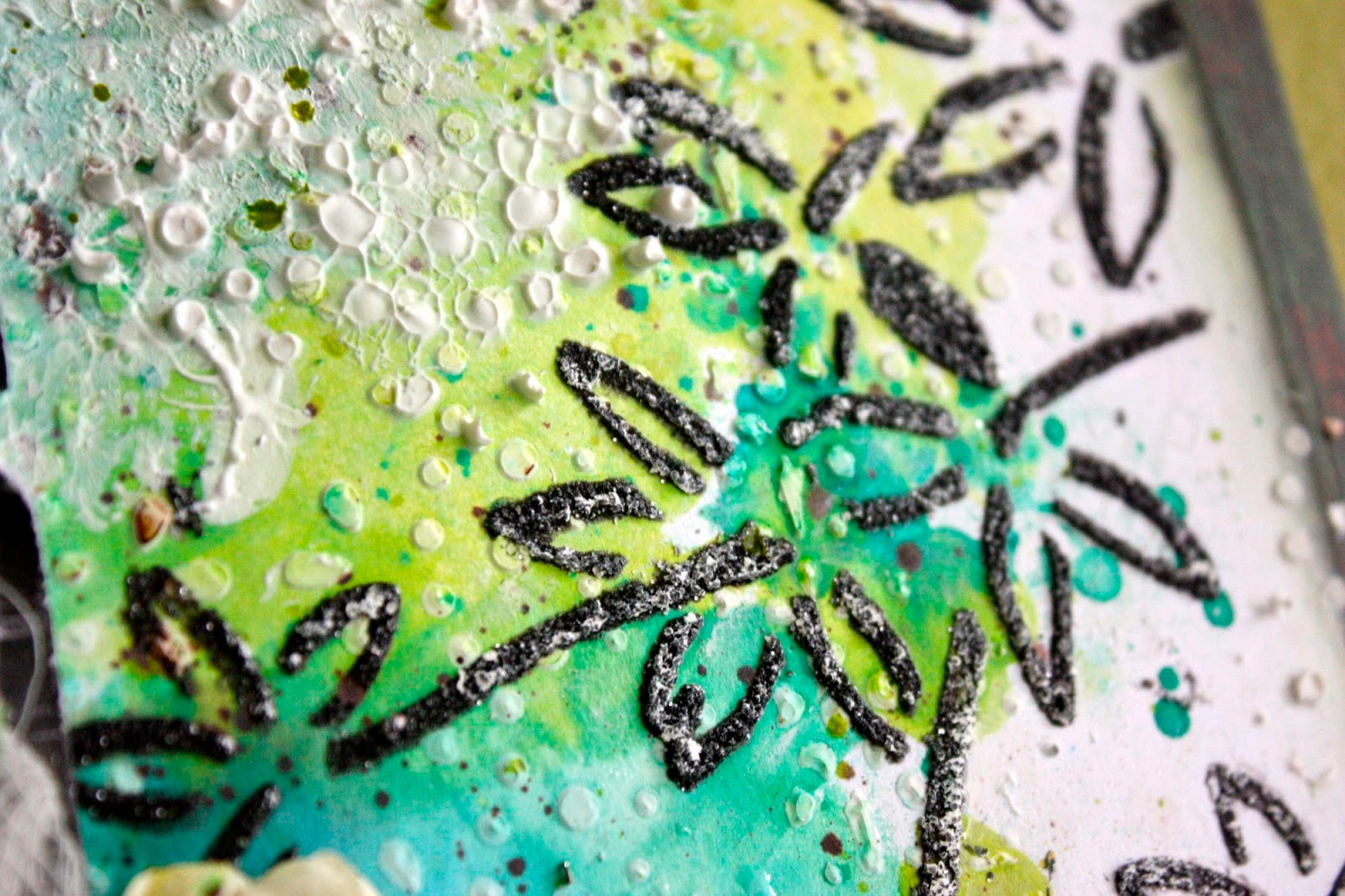
Then I used this Graphite texture paste through the Bamboo Leaves stencil.
I seriously love this graphite paste, although it looks grey when it goes on it dries almost black
and has metal oxide granules in it that give off a slight glittery effect when dry.
Really great stuff!

As you can see by adding a darker colour paste you get some extra dimension, and texture along with that lovely contrast of the black against the greens.
I did rub some white Gelato over the bamboo stencil leaves to help it blend slightly.

Then at the end, once I'd added my papers and photo I did add a little more of the white modelling paste through the lace stencil in some areas that I thought were lacking and it also adding a little more...
yep you got it right TEXTURE!! ;)
Hope you enjoyed todays post.
Cheers til next week
Leonie.
Prima Bamboo Leaves Stencil Bazzill Double Thick White card Stock


Share this post
- 0 comment
- Tags: Modelling Paste, prima, Prima Marketing, Stencils, Texture